- Service ▼
- Products ▼
✨ 20+ Years Experience | 5,000+ Global Brands All Products →
- Sustainability
- About Us ▼
- Related Resources ▼
- Contact Us
The custom box color you choose is far more than a decorative choice. It serves as a vital bridge between your brand and potential customers, influencing everything from first impressions to final purchasing decisions.
Take a moment to examine any custom box you have at hand. The color is never accidental — it is thoughtfully selected to align with the product’s character and visual identity. Every successful brand understands that custom box color is a strategic asset, not an afterthought.
High-end skincare packaging, for instance, rarely features neon or overly bright shades. Instead, its custom box color leans toward soft rose gold, muted pastels, or Morandi-inspired tones. These hues quietly communicate professionalism, gentleness, and trustworthiness.
Now consider packaging for children’s toys. Here, vibrant yellows, bold reds, and energetic blues dominate. These custom box colors radiate happiness and excitement, telling both kids and parents: “This product is fun and brings joy.”
This is how the color of a custom box mirrors the essence of the product. Color never stands alone — it extends the product’s personality and enhances its perceived value.
In psychological terms, this effect is known as the “Priming Effect.” Our brains automatically link specific colors to past experiences and learned associations. When you see a soft, muted box for skincare, you might unconsciously think of morning mist, quiet rooms, clean fabrics, or natural elements — all of which reinforce feelings of gentleness and premium quality.
Thus, the custom box color does something powerful: it helps customers feel a certain way without conscious effort.

The impact of custom color boxes on brands
Selecting a custom box color goes beyond personal preference — it is a strategic business decision. A successful choice considers three factors: what you sell, who you sell to, and the emotions you want to evoke.
Step one: Define the core emotional keywords for your brand.
Before picking any specific shade of custom box color, first establish the feeling words that represent your brand identity.
For example, imagine you launch a cosmetics brand built around natural, soothing vibes. In that case, low-saturation custom box colors such as sage green or olive green would work well — they suggest nature and botanical strength. Alternatively, cool blues or misty gray-blues evoke calmness because blue naturally reminds people of the sky and water.
Step two: Identify the anchor color for your product category.
Below are common industries and their typical effective color choices for paper box packaging. Use this as a starting point for your custom box color decisions.
| Category | Recommended Color | Color Swatch |
|---|---|---|
| Skincare / Beauty | Sage Green | #B2BBA0 |
| Health Food / Organic | Kraft Brown | #D2B48C |
| Electronics | Matte Black | #2B2B2B |
| Children’s Products | Bright Yellow | #FFD700 |
| Jewelry / Luxury Gifts | Deep Navy Blue | #1B2A4A |
| Home Fragrance | Warm Cream | #F5E6D3 |
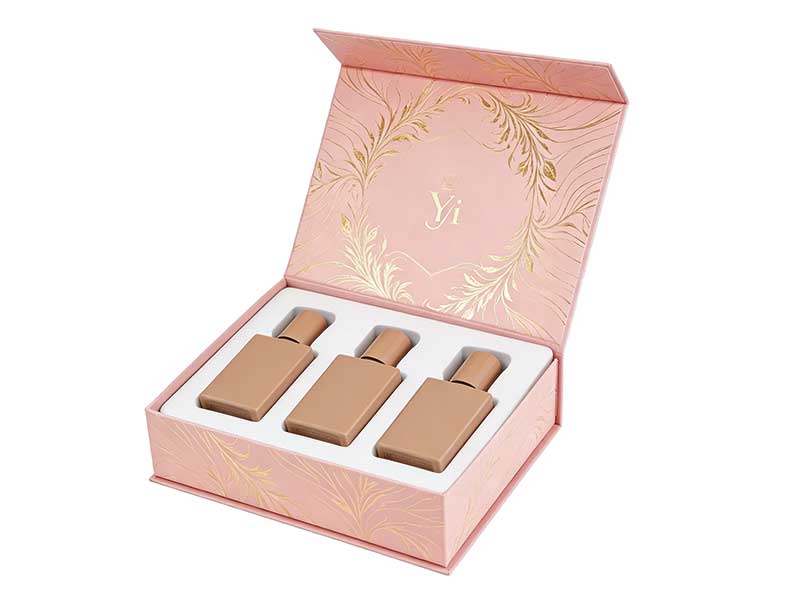
Choose a magnetic box with luxurious color printing for your brand.
Once you have established your emotional keywords and anchor custom box color, the next step is selecting the appropriate printing color model to bring your design to life.
In today’s packaging industry, most factories rely on the CMYK color model for printing custom boxes. Therefore, we recommend you select your colors from the CMYK system whenever possible to ensure the most accurate color reproduction.
If you choose RGB colors for your custom box color design, the printing facility will convert them to CMYK during production. This conversion may introduce slight but noticeable color differences in your final packaging.
Many brand designers also turn to Pantone (PMS) colors for their custom box color specifications. The distinctive, consistent appearance of Pantone colors can significantly elevate the perceived quality of the packaging. When you opt for a Pantone color, the printing factory mixes a custom ink specifically for that shade, ensuring precise custom box color reproduction.
However, Pantone printing carries a higher cost than standard CMYK printing. Each color requires its own printing plate and custom ink mixing. For brands seeking a truly memorable unboxing experience, this extra investment in custom box color is often well justified.
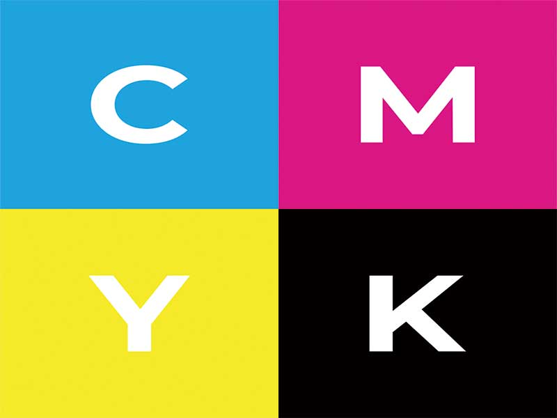
CMYK Printing for Custom Box Color
Now you have a clear method for choosing custom box colors for your brand and products. If you want a faster, more straightforward way to produce custom paper boxes, please reach out to Jinglin Packaging. Our 3F service and dedicated customer support team are ready to help you create the perfect packaging for your brand.
Get a free, no‑obligation quote in under 30 minutes and start designing packaging that truly represents your brand.
Get Your Free Quote →Custom box color is far more than decoration. It acts as a bridge between your brand and customers, influencing first impressions and purchase decisions through the psychological ‘Priming Effect’ where colors evoke specific emotions and associations.
Follow a two-step process: first, define your brand’s core emotional keywords, then identify the anchor color for your product category. For example, skincare brands often use sage green for its natural, calming associations, while electronics gravitate toward matte black for a premium, sleek appearance.
CMYK is the industry standard and more cost-effective for most custom packaging orders. Pantone (PMS) colors offer more precise, consistent color reproduction but cost more due to custom ink mixing and dedicated printing plates. For brands seeking a distinctive unboxing experience, Pantone is often worth the investment.